

Pixpro Stockholm
Pixpro is a Swedish company based in Stockholm with a strong technology background in marketing automation and creating custom portal solutions for their customers. The company has recently undergone big changes and has embarked upon new – and quite successful - international partnerships. Today Pixpro is one of the leading companies with expertise in management consulting; the kind that truly transforms businesses.
Competencies
Brand strategy
Brand design
Brand consultancy
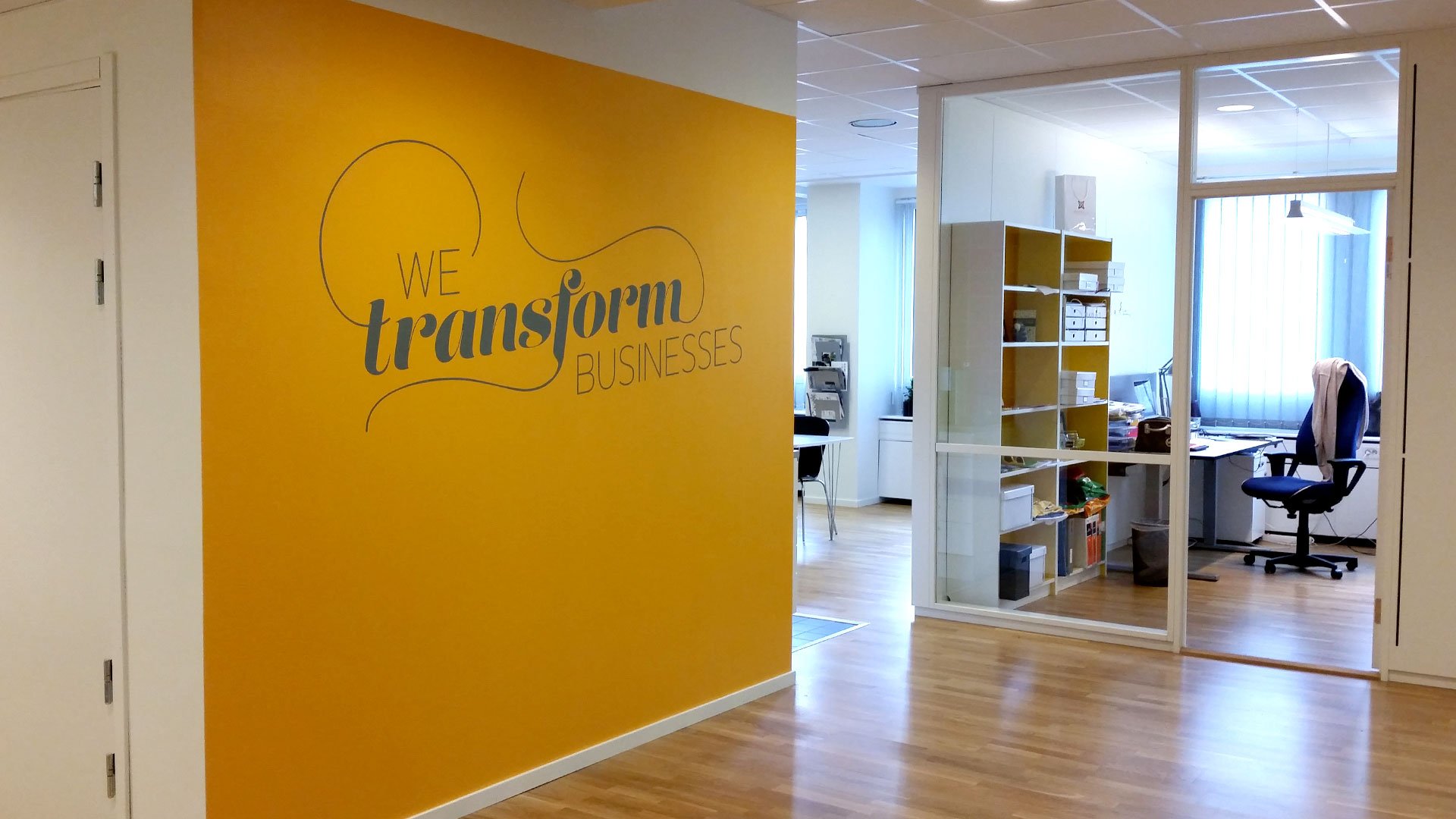
Illustrations for headquarter's offices


The Project. The Story.
The Protagonists
Sarah Watz, founder and CEO, was really keen to give her company a completely fresh and relevant look.
She wanted to present something visible and tangible to Pixpro clients, and simultaneously to infuse some positive energy into her hard-working team. One main concern was to achieve change yet maintain Pixpro’s familiar spirit and feel.
Sarah did not want to change Pixpro’s look completely yet she wanted Pixpro to feel recognisable albeit different. Tall order. But not for our fearless team. So challenge accepted!
The Plot
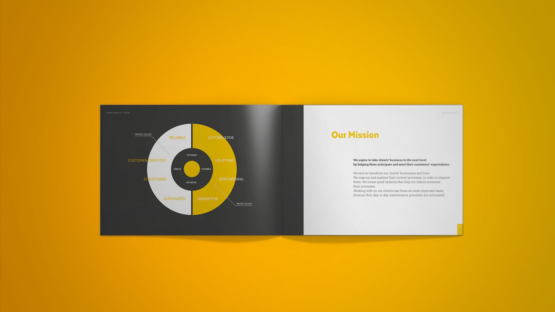
I helped Sarah and her team redefine their company’s mission, vision and shape a new tagline: “We transform businesses”.
During our meetings, the most common words were “Reliable”, “Uplifting”, “Empowering”.
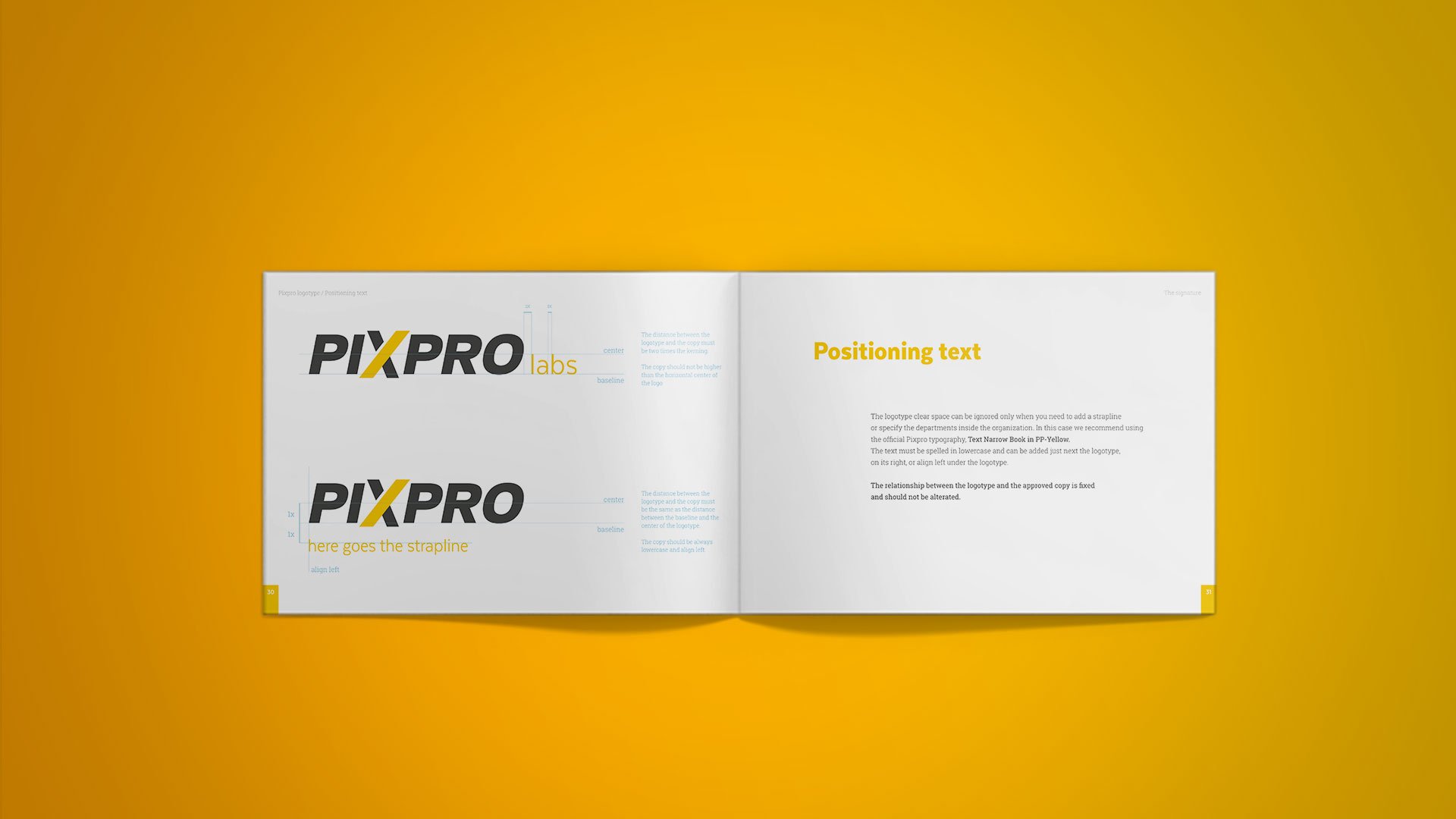
It was obvious to us that the old and enervated Pixpro logotype was not exuding any of these adjectives. It also looked a bit outdated for a company that claims to be at the cutting edge of digital trends. I redesigned the Pixpro logotype using a custom typeface. The font is thick and heavy, but I kept the slanted direction to suggest movement and action.
During our meeting, Sarah said something really important about the way her team works: “In our work, we always look for the X factor that makes our client’s business be unique”. This made me think that it was not a coincidence that the logo had an X in the middle of the word. So why not emphasise it? So Imade the letter X bigger than the others, rendering it a symbol of progress and regeneration.
After defining the new logotype, I focused on how the “new” Pixpro will communicate its revamped identity via the colours, typography, graphics and illustrations. This was achieved with the development of a detailed brand manual. An indispensable tool for the team for building consistent offline and online communication materials.
The Results
Sarah and her team believe that building their brand enabled Pixpro to better compete with the best companies in all of its national markets and support continued growth, increased revenues and market share.
Today Pixpro has a robust and contemporary identity. Sarah gave us the not-so-easy-to-come-by opportunity to partake in an immersive brand experience. This work was exceedingly rewarding for both of us.
The client says:
We love to see our clients use the strategy and solutions we implemented changing their business and life. This is very rewarding.
-Sarah Watz, CEO of Pixpro
