

City of Horten
Horten is a small city in Vestfold county, Norway. During the last years, the municipality has invested some money in refining the perception of the town and encouraging the local community to be part of different and inspiring initiatives.
It was about time to give the city the love and attention it deserved.
Competencies
Brand strategy
Brand design
Brand consultancy


The Project. The Story.
The Protagonists
Europe is a continent of fascinating destinations. A small city like Horten may find quite difficult to retain, thrive and attract young population.
The city of Horten was inextricably tied to its naval port and sea life. A research project conducted by the municipality demonstrated that people love living in such a relaxing and quiet city, but they didn’t find their lives in Horten exciting.
The Plot
In collaboration with Lighthouse, a digital communication company in Norway, I worked on creating a new slogan that could represent the refreshed brand promise and the commitment of the municipality to transform the city into a fascinating destination.
Inspired by the city’s versatility and the brand guidelines developed by Lighthouse for the municipality of Horten, I designed an authentic, informal and future-facing slogan that was going to be added to all the communication materials used by the municipality to promote and communicate events and other initiatives of social interests.
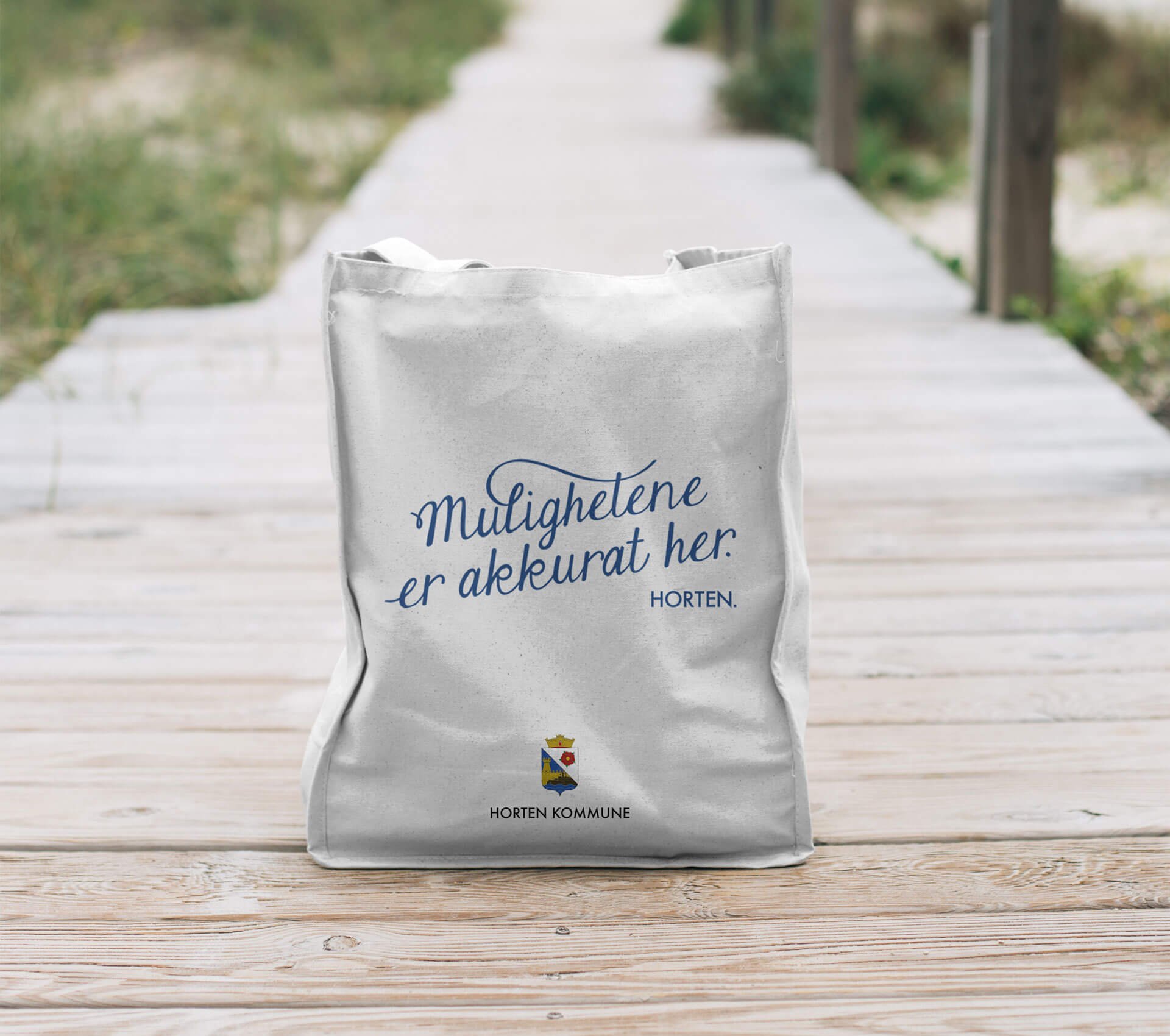
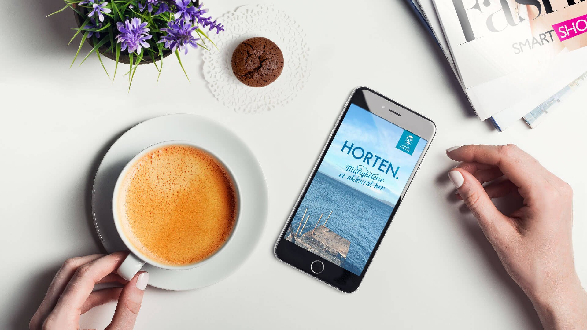
The typeface of the slogan “Mulighetene er akkurat her!” (translated in English: “the possibilities are right here!”) was based on a script font that we customised and modified to represent the characteristics of the Norwegian city: inspiring, innovative, intimate and interesting.
The simple and fresh slogan was designed to work well along with the Horten logotype in Futura and the #HortenLove logotype designed by Lighthouse for a previous marketing initiative.
The strapline was designed to be part of the everyday experience: it worked well on a small and large scale, on signage and information booths, on vehicles, banners and benches.
Together with Lighthouse, I created an appendix to the existing brand guidelines with the aim of standardising, controlling and consolidating the use of the slogan along with other existing logotypes and emblems.
The Results
Numerous events were organised to make the new brand promise understandable and the new slogan visible. After a decade of population decline, the numbers of inhabitants and visitors have increased.
Along with high-visibility signage and banners, the city’s internal agencies are actively using the guidelines in the city magazine, event posters and marketing literature.
The client says:
Our citizens love living in such a relaxing and quiet city. Now they know that Horten can be exciting, too!
-Major of Horten, Norway
