Brickson
Brickson is a new Dutch digital agency based in Den Bosch and Amsterdam.
Founded in 2016, the agency boasts a distinct vision and pragmatic approach. Brickson focus areas are diverse and aimed at increasing value for their clients, and for their clients’ clients.
Competencies
Brand design
Brand consultancy


The Project. The Story.
The Protagonists
With more than 20 years of experience, the team behind Brickson is made of highly experienced, talented, diehard professionals.
The Plot
Brickson team had a lot of resources to share with me even before I got around to asking them. The company’s mission, vision and values were already in place, internally discussed and agreed upon; all in all a great privilege for us to to be working with such a high level of “brand awareness”.
As with most of the brands I design, I always take our clients on a journey of discovering the “authentic face” of their brand by playing a famous game: “If x was y, what would it be?”.
So the game goes something like this: “if Brickson were a drink, what would it be? If Brickson were an animal, what would it be?…”
In this way, I was able to piece together an authentic personality for Brickson and a unique tone of voice even before embarking on the development of their logo.
The game helped me confirm that Brickson has a masculine and pragmatic character, with a vibrant and human voice. Through the use of a mood board, we defined the visual language, inspired by luxury, glamour, and the exuberant style of the Art Deco period, when the use of expensive and precious materials was common practice and highly decorative forms were juxtaposed against the simplicity of mass-produced goods.
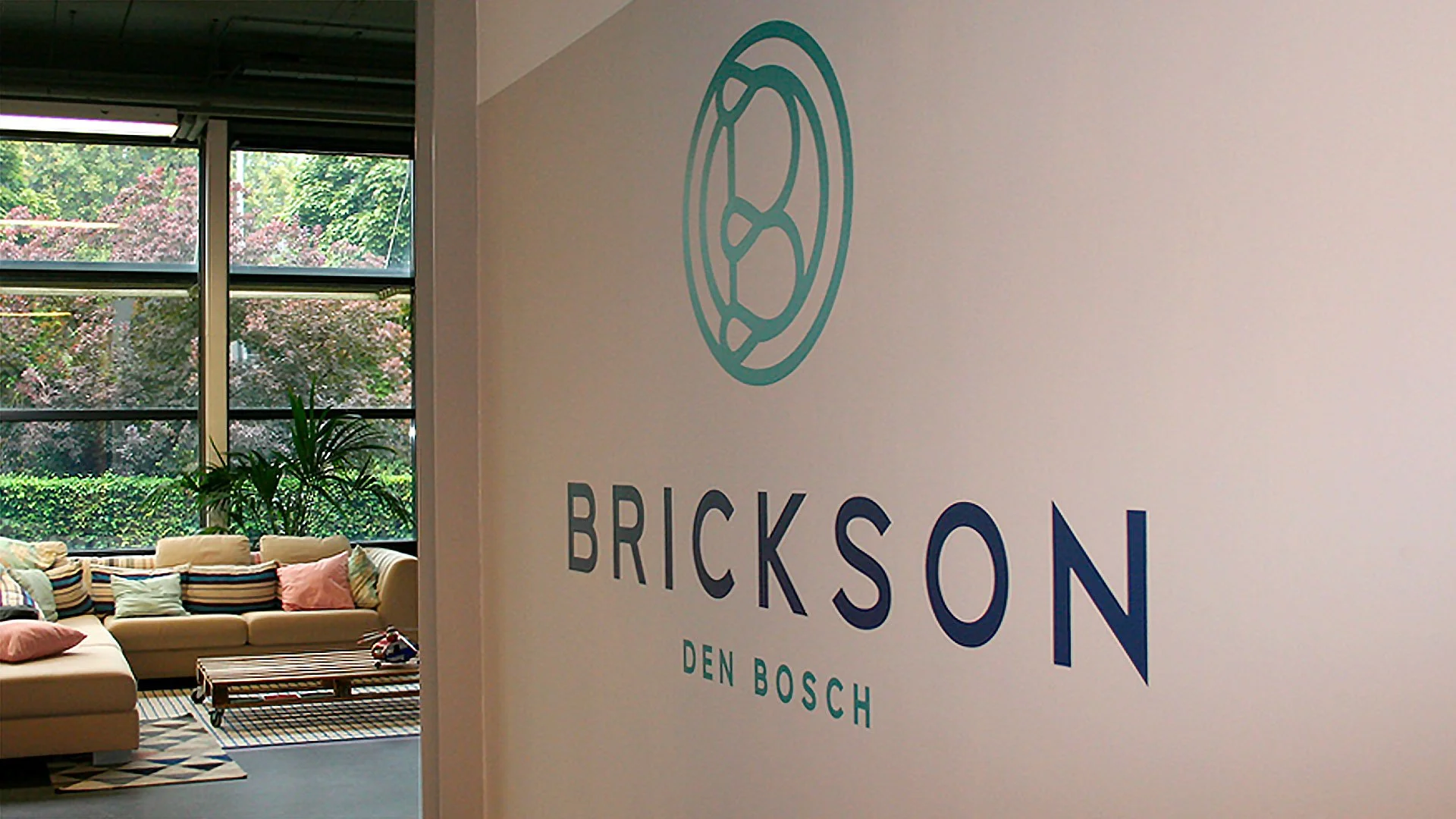
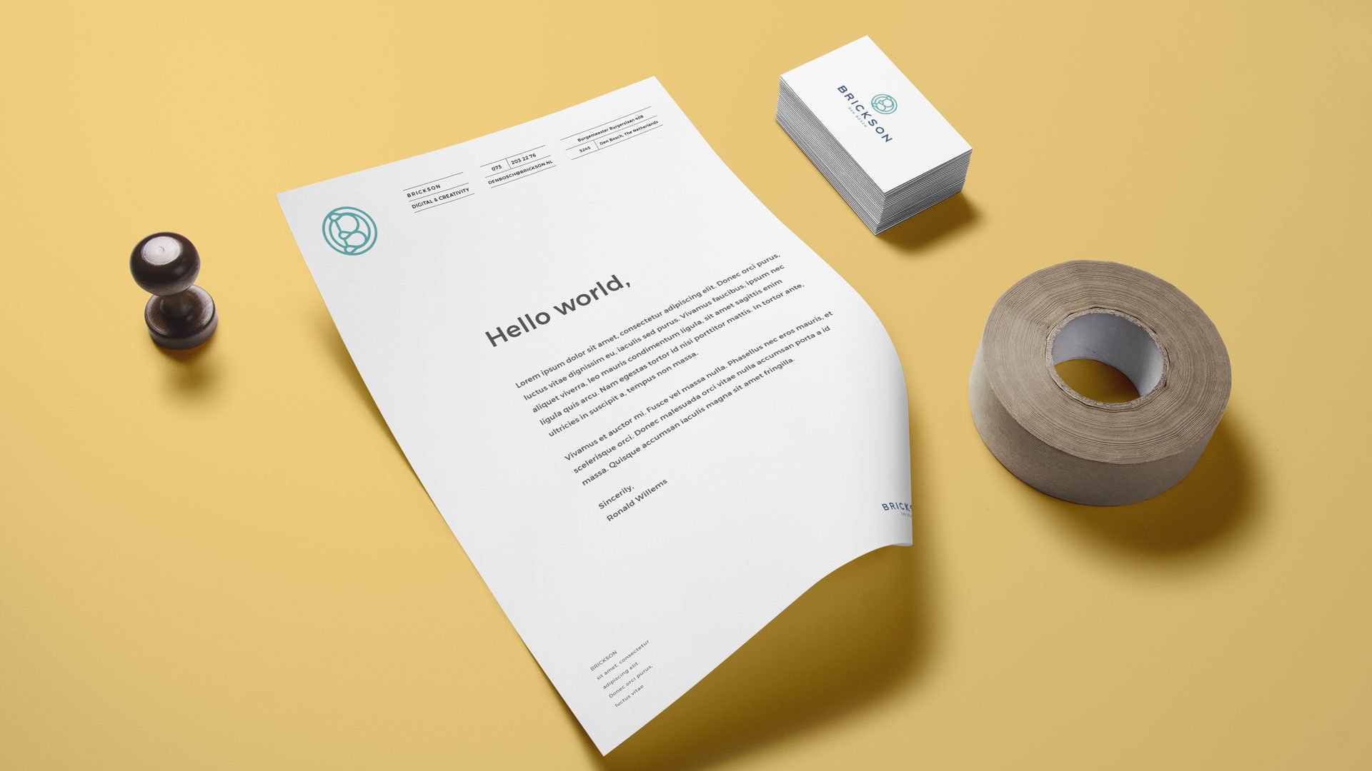
Although the company was newly founded, they were eager to explore an “old” and “established” look, that would predominantly exude reliability and experience. I felt that only a bold, authentic and eye-catching brandmark could represent all these qualities at once. Influenced by the modern and stylised shapes of the Art Deco style, the letter B became the symbolic representation of Brickson’s aspiration and values. As if shaped by the experienced hands of a craftsman, the sophisticated and smooth lines of the company’s symbol complement the rigid, widely kerned and bold bespoke typeface.
The last touch involved creating 4 different “stamps” in four different colours that identify Brickson’s main focus areas.
The four new colours were added to the main brand colours, creating a bright and rich palette reminiscent of Art Deco fashion and interior design.
The Results
Today Brickson is a recognised and highly valued digital agency in the Netherlands. Their confident look and friendly approach is the key to their success.
No wonder big clients trust them with their brands and products and follow their suggestions when it comes to building solutions that add value to their businesses
The client says:
Brickson aims to unburden its clients.
-Babs Gösgens, CTO at Brickson Den Bosch
